User Interface Design in Mobile Apps

The importance of a great user interface and experience in mobile apps
With mobile usage growing each day, us as designers need to come up with more and more intuitive ways of providing a fluid and intuitive experience to our users within the constraints of the mobile platform. We have had to move our priorities from desktop to mobile and this article highlights methods in which you can provide a great user experience with very few pixels.
Make your app clear
One of the main annoyances of a poor user interface is when you haven’t a clue what to do. Actions need to be clearly identified and users need to know exactly what they are doing with clear and concise prompts.
Rule of thumb
Unlike my granddad, most users tend to use their phone with their thumbs. This is an important consideration when laying out an application flow. For example, if a user is a filling out a form, they should be able to navigate through fields in the lower part of the screen. An even better approach (if possible) is real-time validation meaning when an input has been filled and passed validation they should automatically be forwarded to the next to complete, reducing taps and giving a much better user experience.
Icons for text
Icon design is such an important part of mobile design. They take up a fraction of screen space while being a lot easier on the eye than plain text. Yet poor icon design can be a big problem, people need to instantly know what the icon simulates and have a good idea what will happen when they tap it. Here at Atom Engine we user test all our icons, ensuring that only the most recognised ones are used. If the action of the icon is still slightly ambiguous then consider adding captions on thumb down, or a first launch tutorial.
Remember your OS
Always consider which platform you are developing for when designing a UI. Android and iOS have subtle differences in their native UI’s that shouldn’t really be mixed. For example, the back action on iOS is either top left or a cross screen pan. Android however has its own back button. As native developers we believe in giving a UI that the user is already familiar with, so would always recommend adjusting your gestures and button positions dependent on the platform you are developing for.
Storyboard and test first
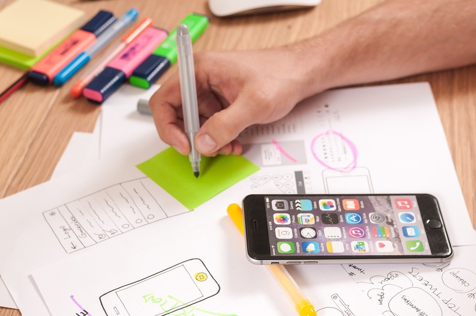
When developing non standard gestures for actions we would always storyboard a design, place the image on a real device and user test the intuitiveness of the gesture. The last thing you want to do is develop a gesture that no one knows exists.
Mobile or Tablet
You should always consider altering the user interface between mobiles and tablets. Tablets offer much more space and you should therefore be able to cut out the number of taps required to carry out an action. An example of this is using split screen to show list and detail views all in one screen.
Conclusion
We hope you have found this article a useful insight into user interface and experience. If you would like to talk to us about an app design/development project you have in mind then please contact us here.